June [was] Bustin’ Out All Over: The Month in Health Equity Research
by Future Historian July 5, 2021Good ideas and interesting findings are a dime in a dozen. The really critical challenge, at least to us, is getting these ideas into practice where they can impact more people. This is why we’re so into implementation science as a means of working toward equity. By fostering the conditions that enable effective implementation, we can see improved outcomes. But, it is not sufficient to want to reach health equity outcomes; our interventions must be designed and delivered equitably too.
And this is where a recent article by Woodward et al. adds value; A more practical guide to incorporating health equity domains in implementation determinant frameworks. The authors don’t just talk about including equity in implementation frameworks. They provide a series of measures to help gather the data to tailor and modify implementation factors. I cut and pasted a sample of Table 1 below that contains some of these sample measures.

While the authors lean maybe a bit too heavily into the kind-of-complicated i-PARIHS framework, they identify ways to consider 1) Cultural factors, 2) Encounter factors (so, those that pertain to the point-of-service interactions between patient and providers(s), and 3) Societal Factors (which include economic, geographic, and sociopolitical concerns). The last column of Table One is really the sweet spot.
There’s really been a surge of equity-related research in implementation science. We’ll keep monitoring to see how the field does at improving how interventions are implemented in diverse settings.
Monthly Results
We slightly changed our search strategy this month, and wow, it made a difference. First, we pulled all the abstracts published in the last 31 days from these publications. You can click on each title to go right to each journal’s home page:
- International Journal for Equity in Health
- The Journal of Equity in Health
- Health Equity
- Journal of Health Disparities Research and Practice
- Journal of Racial and Ethnic Health Disparities
- Cancer Health Disparities
- Diversity and Equality in Health and Care
Next, we did a general search for recent occurrences of “health equity.” This yielded a total of 446 articles, so a really nice number, but way too much to comb through, unless you planned on doing nothing else for the next few weeks. Of course, that’s why we’re here.
Of these, 35 were review articles. We have a special place in our hearts for review articles and like to call these out. We generated a .pdf table that can be downloaded at the link below that contains the title, journal, and authors.

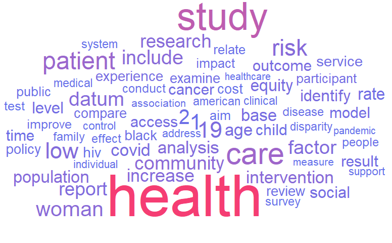
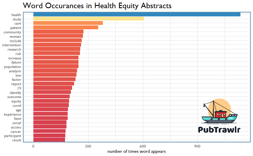
To begin our look at trends, we can start with word frequency. These first two figures show the frequency of key words across these 446 abstracts. Some people like word clouds; some people like bar graphs. Here are both showing the same data in two different ways. Apart from the expected prevalence of COVID-19, we also see that woman is just outside the top 5 most frequently occurring terms. The only other clinical conditions that show up are HIV and cancer.

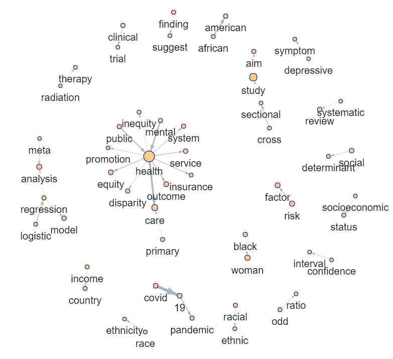
The network plot is slightly more informative because it shows the relationships between words. What this does is looks for the most frequently occurring strings of works across the abstracts. There are really three categories of strings here: 1) methods (like clinical trial or cross-sectional), 2) health (that big cluster in the middle), and 3) study-specific conditions, like (depressive symptoms, social determinants, and African-American.) However, this can be a crude organizing structure to describe 400+ articles, so let’s turn to topic modeling.

Topic Modeling
Topic modeling presumes that topics are clusters of words, and that each article abstract contains clusters of topics. We used LDA to group all 446 abstracts into 25 categories, then extract what makes each topic distinct. We then assigned each abstract to the topic it best represents and counted them all up. On the vertical axis, we have the topic number (not really relevant), and the key distinguishing words for that topic. Then, the bar graph identifies the number of articles for each topic.

No surprises here. The largest topic was COVID-related, specifically around some of the public health interventions including the lockdown. Other topics that jump out are Equity, Public, & Implementation (30 articles), cancer, screen, cervical (18 articles), and water, drink, safe (11 articles). In order to ease exploration of these topics, we found the article that best represents each topic and generated a similar .pdf table. You can download it at the link below.
One of these articles really caught our eye: “Inequities in the delivery of mental health care: a grounded theory study of the policy context of primary care.” This was the best representative of the 22 articles for the care, mental, primary topics. The full text available is at that link.
The team at PubTrawlr is especially interested in the mental health-primary care article for a few reasons. First, I (Jon) started out in behavioral health and substance abuse years ago, and that setting and work was so transformative in how I approach social problems. (I’m writing a blog post on this that’s coming soon-ish). Second, we were involved years later with Dr. Victoria Scott in a project to integrate behavioral health and primary care. Third, we just love qualitative methods, as you might imagine.
Returning to the study, while the theme of “inadequate resources” was a given, I found the rivalry aspect to be surprising. I’ve never encountered this competitiveness between clinics before. I’m not so naive to think it wasn’t there; it’s just that no one had ever thought to mention it before.
Relationships Between Topics
The last visualization we looked at was how the topics related to one another. This is a correlation plot, where thicker lines mean stronger topic relationships. These correlations aren’t that strong to begin with. We filtered for those that were stronger than r = 0.25. However, these do show some mild associations between some of the key topics that are worth exploring.

How do public health professionals consume research? Help us find out!
As part of our mission to get science out of journals and into the hands of the people who can make things happen, we’re gathering data about how public health professionals stay on top of the research. We’re offering some pretty cool swag in exchange for answering a few questions about how the experts stay current when balancing all the other responsibilities that come from public health practice.
[wpcdt-countdown id=”655″]
We keep this survey open for a limited time; until the clock runs down. So if you’re a public health professional (or know one!) please take this brief survey by clicking the link below! A survey monkey will open.
Edit: July 9, 2021. The survey is closed! We’ll have more opportunities to contribute in the near future, so stay tuned!

Leave a Reply